Saturday, October 24, 2009

Photoshop Day 4

This morning session started a bit different than usual--that is, instead of a Learn@UW Quiz, we kicked it off with blogging time from last session--since the Permit test took up most of the time, the students didn't get the chance to blog about their Compositing projects.

Today's session was all about drawing in Photoshop using the Pen Tool to create vector images. The pen tool can easily be seen as one of the most complicated tools to use throughout all of the Adobe Products, but with that said, it can also easily be seen as one of the most powerful--and the students definitely saw one side of its awesome abilities today with some of the Photoshop vector illustration examples that were shown to them.

So as always, after the pen tool was introduced and instructions were given on how it is used, the challenges of the day were introduced and a lot of the students got started on them right away, working straight through their first break.

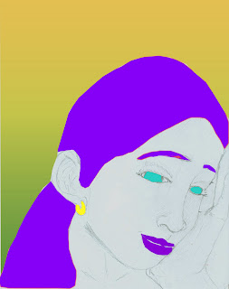
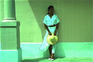
The challenges for today were "Comic/Coloring Book Style," where students could either draw an image by hand, scan it, and vector/color it in Photoshop, or use one of the provided sketches to vector/color in Photoshop, and "Fix Your Photo: Vectoring Edition," where students had the option to take an image of themselves or someone else and "vectorize" it, or make it look like a cartoon (a lot of the students were really interested in this challenge).

Check out some of their cool pen tool vector projects:


Here's Jose's vector illustration project:


He did a great job of outlining or "digitally inking" the contours of the original sketch of this image, as well as the coloring-in of it.


Here's Dylan's vector illustration project:


He made great use of the "fill path" technique with the pen tool as well as adding a customized gradient background, and although the illustration isn't complete, he got off to a great start.


Here's Collin's vector illustration project:


He did a remarkable job of "vectorizing" this image of Tupac Shakur with a great attention to detail and shading.


Class ended with the usual class blogs from this session where the students uploaded their projects they'd been working and wrote about how they went about creating them. Once again overall it was another good session for the morning Photoshop Unit and the students walked away with some newly learned Photoshop skills.

Illustrator rocks perspective!

Congrats to those in costume today!

We got started on time! There were some You Tube videos about perspective drawing running on the screen when everyone was coming in to the room and then everyone took a Learn @ UW quiz. The first question was what the difference was between vector vs. rastor art. (What? The students couldn't give the answer immediately? We definitely need to review that concept a bit more!)

Then we looked at a lot of different things: images, videos and a powerpoint that showed perspective drawing. Everyone took a few minutes to make a simple perspective drawing on a sheet of paper.

After we took a break, we learned about The Rule of Odds.

The Rule of Odds is that the human eye is more attracted to an odd number of shapes than to an even number. After talking about why, we guessed that maybe it was because of the human face and the fact that we feel at home looking at two eyes and a mouth (an odd number of shapes). We aren't sure why, really. We looked at some examples of Paul Cezanne's art because he used the Rule of Odds in a lot of his paintings.

Chou showed us an AWESOME demo of how he creates a design with Illustrator. Everyone (even if we were all feeling a bit like we won't ever be able to do it like Chou) worked on making a t-shirt design. The students were working on some great stuff and everyone seemed to enjoy the activity as well. Way to go us!

Then, after our second break, we got serious and took a permit test. How did we do? We'll have to wait and see!

We had some blog time and some time to keep working on our t-shirt or web designs, then it was off to lunch (Potbelly's! Yum!).

Overall, it was a pretty darn good day: We learned some stuff, we had some fun, we used technology and we made some cool designs.

Sunday, October 11, 2009

Photoshop Session Three!

The session went over rather well.

Oh, more....yes, more. So in our class (Chris and Ryan) we went over the concept of compositing (blending two or more images). Some of the best examples of this include what you may see on Conan O'Brien:

So you have Sienna Miller and Daniel Craig...


Which then when composited looks like this:


A face only a mother could love...

Now, we did not expect our students to make something as disturbingly awesome as what you see above. However, many of our students took to the exercise well, and made some pretty cool pictures in the process. Take DJ for example, who used a smiley face as part of one of our exercises and blended it into another background, the before and after is below:

Before:


After:


Colin took a picture from the album cover of Michael Jackson's Thriller and combined it with headshots of students from the class:


Ibadete is planning on making an army of clones to storm a soccer pitch! The work in progress is below, but I can't wait to see the final product!


Especially in Ibadete's work, notice how well her multiple copies are blended in with the other Ibadetes. The work is so well done that it actually looks like there are five of them in this photo.

Besides compositing, the students also learned to work with HDR and adding filters to their pictures. Although to be sure, the students really took to the compositing images above all the other activities, and spent the majority of their time doing mashups.

In the third part of the class, we had our permit test, but beforehand did a quick mock up of Jeopardy to get the kids thinking about the materials. In general, the students did very well in the quiz and will do much, much better on the 2nd permit test once they learn more about Photoshop.

If anything, there should be one very core lesson to learn combined with activity during these sessions. Photoshop is a hard program to learn, and many of the students, especially those who do not use Photoshop during the week (although they should) seem to have to start all over again getting used to the program before they can start the activity. But overall, the class took to compositing, and I hope they keep up with the great projects in the coming weeks!

Saturday, October 10, 2009

Color me Illustrator: Day Three

Aneda's Taste Drawing
"bitter, relaxing, sweet"


The first thing we did was a warm-up free draw. Eliza gave everyone a selection of candy and dried fruit. She told the students to use Illustrator draw whatever they wanted and to let the flavors inspire their drawings. Everyone came up with very interesting drawings using various colors. Some students used the warp and twirl tool and others found symbols to add to their drawing. Some students were drawing more abstract images that reflected their sensory experience, while Kim drew a plum and a peach because those were the fruit flavors she was tasting.


Besma's taste drawing


Aubrey's taste drawing
"Toughts provoked by Eliza giving us sugar"

Next, Chou demonstrated live trace and live paint. He showed how to upload images and then how to change the settings in live trace to affect how the image looks. Then he demonstrated the way to select colors and add them to the image using the live paint bucket.

After that, Eliza talked about how to use color effectively so we can make really cool designs. She showed the color wheel and the students identified the primary, secondary and tertiary colors. Then we talked about what complimentary colors are: they are the colors directly across from each other on the color wheel. Analogous colors are next to each other on the color wheel. We learned that different color combinations create different moods and feelings in a design. Also, Eliza explained that to make a really interesting picture, the colors can be used in the proportion of 3:2:1. That means that you choose one color for about half of your image, then choose the complimentary color for 1/3 of your image and last you choose another color for contrast and use that for only 1/6 of the image. We looked at several examples to help us see what that means.

After break, everyone worked on images using live trace and live paint. Sometimes it was frustrating because when you don' t know how to use the tools yet, you have to keep experimenting and trying different things and sometimes it is hard to make it look like you want it to, so you have to just keep trying. The first images were line art, some of them were cartoon characters. We all chose the image we wanted to work with and practiced using the tools.


Kim's Livetrace drawing


Nick's Livetrace drawing

The next project was a really interesting one. We got together in groups and chose an image to use to express the four seasons and then we each worked on one season. It was really interesting to see what everyone did with their images.

During break time, our friends from the Photoshop class came over to check out what we were doing and then some of us went over to see what they were working on. Everyone was making such great stuff! And it was fun to show each other our work and talk about what we were doing.

After our break we had a little more time to work on our Four Season images. Then we did a class critique. Because the images were about the four seasons, a lot of people used analogous colors and the ideas were often based more on warm and cool color schemes.


Clara's Four Seasons


Patrick's Four Seasons


Juan M's "Winter Flower Flurry"


Itzel's Autumn Rose


Nandi and Saige's four seasons drawing

Lucy's four season's drawing

At last! Behind the Wheel work time! This was just an introduction to our BTW, but we thought about what kind of website we want to make. We looked at the web designs we started last week and some students deicded to keep the design they started with, but others were looking at other ideas. Then everyone worked on their blog and posted an artifact from the day's work (or tried to!)

Overall it was a very productive day. Everyone did at least three drawings and did a great job too!

Tuesday, October 6, 2009

Photoshop Session 2

This session of Photoshop was all about Enhancement & amp; Restoration. So we covered a lot of things relative to that topic, such as the presence of balance in an image, the concept of "beauty" both within an image as well as in general, the importance of "keeping your project live" by using different layers for different changes, and finally we talked about some Photoshop controversies that are out there and knowing when enough is enough (if there is indeed a limit) in editing/enhancing an image.

As a related challenge for this session's topic, students were to have their own photographs taken before for them to work with. Unfortunately, there were some technical difficulties with the cameras we were using (apparently the batteries were feeling a bit fatigued and needed to be re-juiced) and we weren't able to take all the students' pictures, thus not enabling us to let the students use them in their challenges for the day as planned. However, we were prepared with an alternative: the students were supplied with a folder filled with old, tarnished, and esthetically challenged, un-edited photos to work with and practice some of the great enhancement & restoration Photoshop tools, adjustments and techniques they were exposed to.

Check out the before-and-after projects that some of the students were working on!

Here's DJ's before & after project:


He did a great job of increasing the lighting in the shadows of the image so that everything could become a lot more visible!


Here's Dylan's before-and-after project:


He made good use of his sharpening tool in this one in order to establish the contours of the cat's face more!


And here are Natalia and Ibadete's before-and-after projects (Although they both used the same image to use work on, they took two completely different approaches to it):


Ibadete did a flawless job of editing and changing the woman's eye color as well as giving the photo an overall soft-light effect which really compliments the woman's expression and facial stance in
this image!


And Natalia did a remarkable job of changing the woman's hair color, eye color, and enhancing the highlights on the face!


We might have to let those magazine image editors out there know about some possible new competition coming their way. =)


At the end of the day, the students were asked to blog about their experiences with Photoshop, and once they were all able to get into Blogspot they were hard at it. They’re sure to have some interesting things to say, and us instructors are looking forward to reading them!